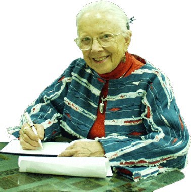
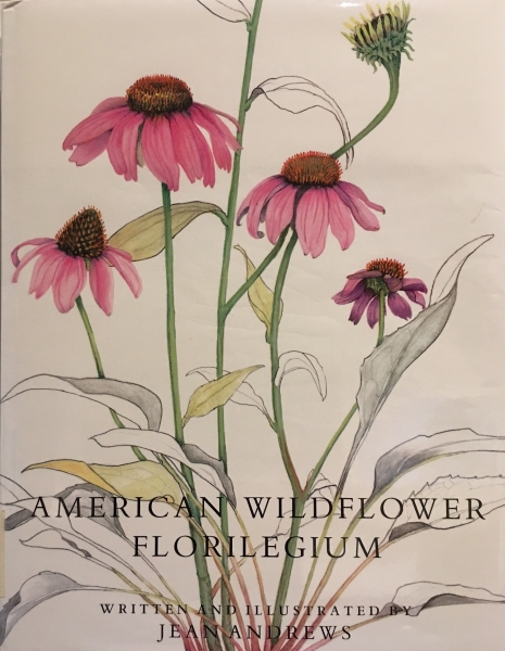
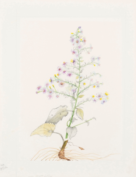
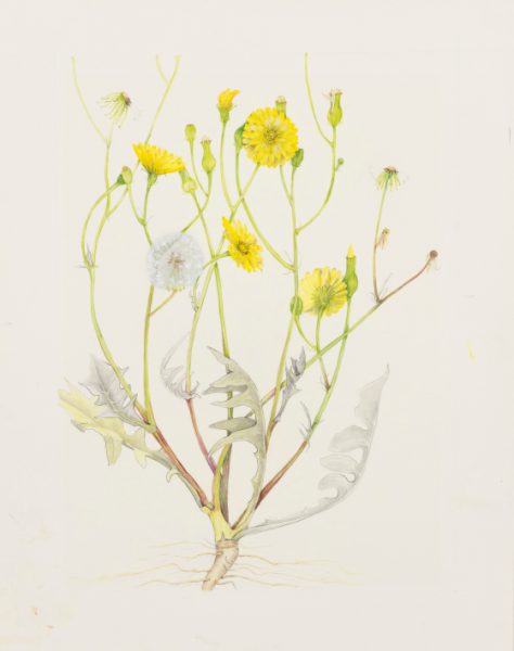
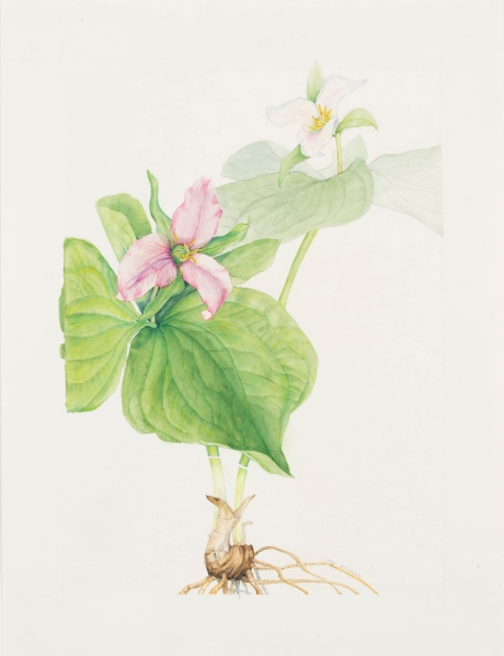
FAE is excited to have five mixed media works on paper from the estate of one of Texas’ most interesting polymaths, Dr. Jean Andrews, The Pepper Lady. Jean Andrews (1923-2010), was enamored with the natural world, and when she saw something in nature that interested her, she would generally become expert enough in the field to write a scholarly monograph on the subject. And, in addition to researching and writing the book, she would often create her own expertly rendered paintings, graphite and gouache drawings, and/or photographs to illustrate them.
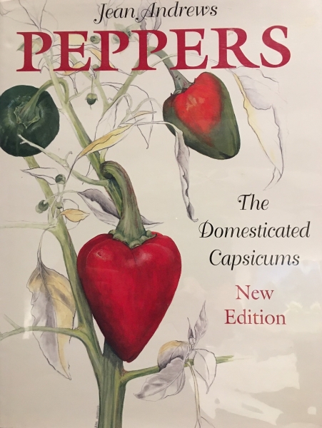
Although she authored books on The Texas Bluebonnet (UT Press, 1986), Seashells of the Texas Coast (UT Press, 1972), and American Wildflower Florilegium (University of North Texas [UNT] Press, 1992), she was best known for her books on Peppers. Her most successful being, Peppers, The Domesticated Capsicums, published by University of Texas (UT) Press in 1984. It was considered “THE” book on peppers because, in addition to carefully illustrating each pepper plant so it showed the life cycle of each type of pepper from flower bud to mature pepper, it included scientific, cultural, and historical information. The book was so popular, the publisher produced two subsequent editions. She became known by pepper aficionados as “The Pepper Lady”.
In the Summer of 2010, in issue 86 of the American Botanical Councils publication, HerbalGram, The Journal of the American Botanical Council, Kelly E. Lindner wrote a scholarly memorial to Dr. Jean Andrews, The Pepper Lady titled: Jean Andrews (1923-2010)
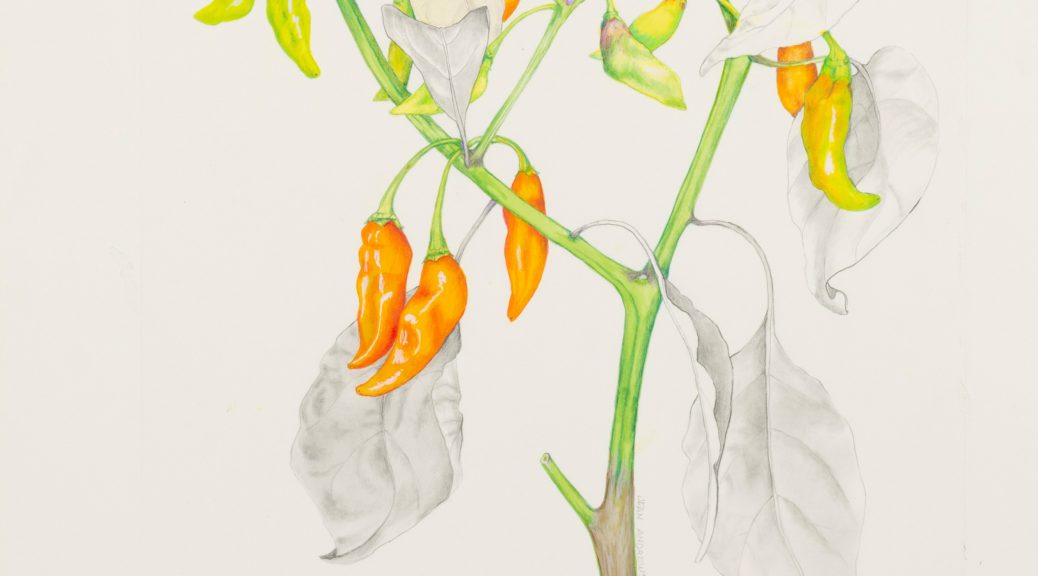
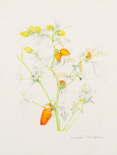
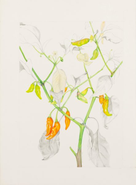
The following two illustrations were drawn for Dr. Andrew’s best known book: Peppers, The Domesticated Capsicums
UT Press, Austin
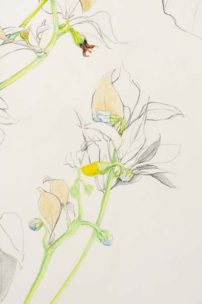
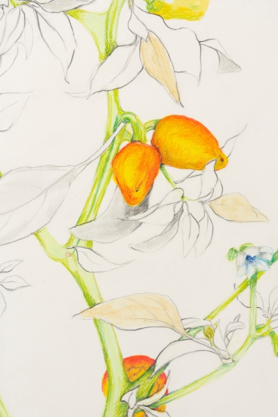
Plate 12 Floral Gem
The images above and below are details of Floral Gem. They show Dr. Andrews intention to show the development of the pepper from flower bud to fully developed pepper in a single illustration. All of the illustrations she made for this book convey this concept.
Below is the second illustration
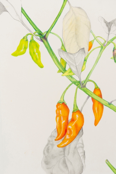
Plate 29 Datil
A detail of Plate 29 Datil
_________________________________________
The next three illustrations are from the book: American Wildflower Florilegium
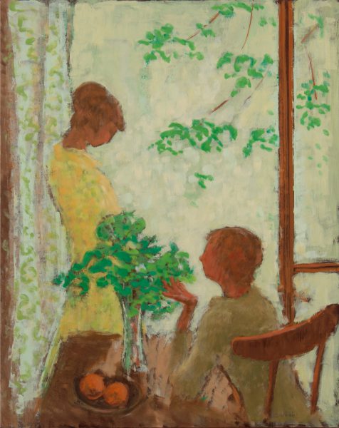
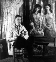
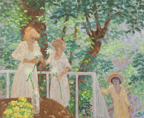
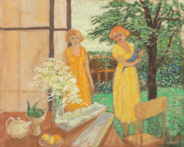
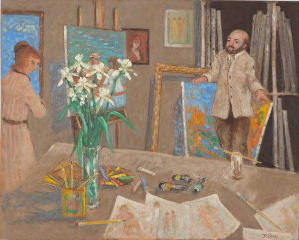
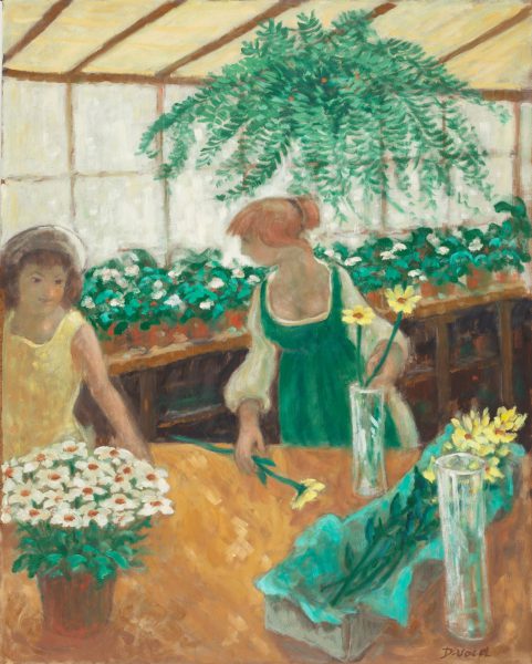
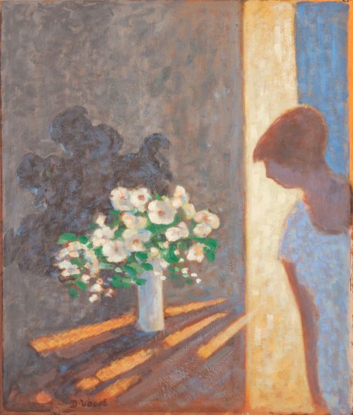
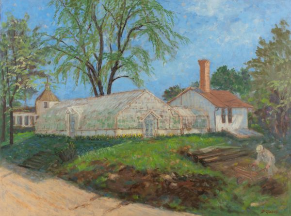
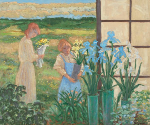
Amongst the literature that is available on the art and life of Donald Stanley Vogel, are numerous articles, reviews of shows, and even an autobiography titled Memories and Images published by the University of North Texas Press in 2000. There is, however, very little information about his philosophy and studio practice. As the middle child of three, I grew up watching him paint and listening to him talk about his work with other artists and friends. So, while his voice and actions still resonate, I though it wise to document what I saw and heard while watching him paint and listening in on his art-related conversations.
Historic Influences
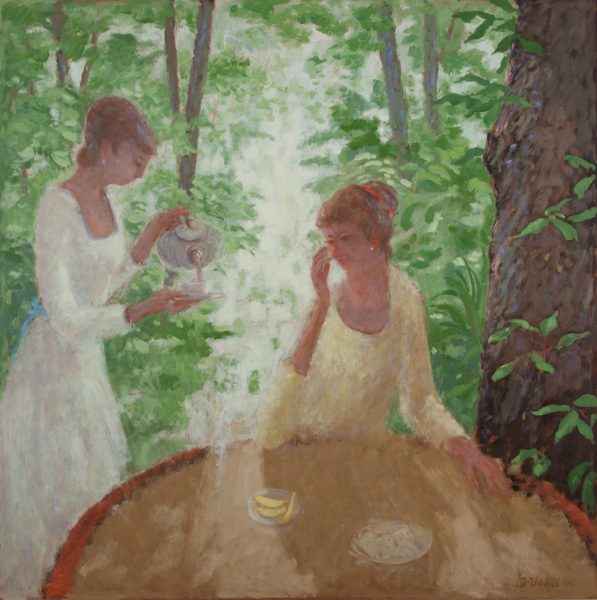
Anyone with a limited knowledge of art history can see that Donald’s style was highly influenced by the French Impressionists, the Post-Impressionists, and with a little more expertise, would include the Nabis and the School of Paris. As a young painter during the Depression, he attended the Art Institute of Chicago and practically lived in their Impressionist galleries. The country was in
the midst of what would later be called the Great Depression and most of his fellow students were painting subjects that reflected the difficult times around them. In contrast, he decided that the art he would produce from then on would lift people’s spirits like the Impressionist paintings he had grown to love.
Using His Imagination
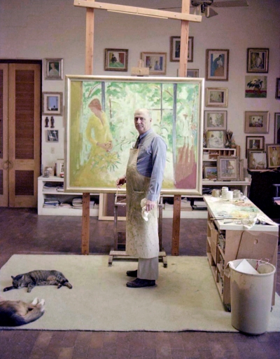
For most of his career, unlike most of the Impressionists, he was a studio painter. He always started a painting with a direction in mind, often generated by a sketchy line drawing of a composition he thought would be challenging. After recreating the important elements of the drawing on a canvas or panel with a burnt umber or raw sienna thinned with turpentine, he would then brush in areas to establish a compositional structure before starting to paint freely with color. But like the subjects he chose, the colors used and how they were employed came from his imagination. Donald often said that he preferred working this way because once you set out to paint something that is in front of you, its presence immediately influences the direction your imagination will take.
Puzzle Master
When Donald stepped up to a new panel on his easel with brush in hand, his approach to painting was to solve a puzzle that had an infinite number of variables and an astonishing lack of rules. He considered the puzzle solved when the imaginary image that then covered his panel had become a “painting.” He defined a “painting” as a work in which the need for another brushstroke, or the removal of a brushstroke, would lessen the artwork’s overall quality. With or without that brushstroke, he said that to his way of thinking, the painting was just a “picture.”
The Figure as a Piece of the Puzzle
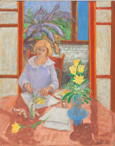
Although his paintings were of interiors, still-lifes, and landscapes, the figure, or a group of figures, was a ubiquitous element. To him the figure, as with all other elements, was only there as part of a composition, just another piece of the puzzle to help move your eye through the painting. He also intentionally clothed his figures in generic outfits so that the painting would appear timeless. When asked how he was able to put figures in his paintings without having a model to work from he would say that “after making thousands of drawings of the figure in my youth, it would be sad if I needed to work from life now.”
The Artist’s Palette
Donald derived his colors primarily by tinting white paint. Being right-handed, his white Formica covered palette sat on his right side. At the top of the palette, closest to the easel, was where his containers of brush wash (turpentine) and stand oil were located. Just below that was a heaping mound of white paint. He would drag a dollop of white out into the middle of his palette and then tint it by mixing in the color or colors that were laid out in a semi-circle around palette’s inner edge.
Donald created his own white paint by mixing equal parts of Lead, Zinc, and Titanium. Experience had taught him that each of these whites had positive and negative attributes and mixing them together would limit the negative aspects of each. Throughout his career, he was happy with the results.
Painting in a Frame
Often, especially with larger sizes, Donald would place a prepared Masonite panel in a frame before starting to paint. I learned over time that he normally did this for two reasons.
1. It visually separated the edge of the painting from the chaotic, painting covered wall that was opposite his easel.
2. It steadied the edge of the flexible prepared Masonite panel so it would not bounce back into his brushstroke.
For him, it made painting on panel in his studio easier. For the framer, the linen liners that he used in his frames had to be replaced often because they were usually adorned by errant brush strokes and it was not easy to convince a client that it was a plus that they were getting a free hand-painted liner with their Vogel.
Painting to the Beat
When Donald was painting, there was always classical music playing in the background. He would often talk about how music and the elements of traditional media like drawing, painting, and sculpture were similar. His brushwork was quick and direct and flowed without hesitation between his palette and painting, with a rhythm often in synch with the music that was playing. On numerous occasions he would say that if he had not become a painter, he would have liked to have been a symphony conductor.
A Revelation…
Even though the figure was a constant compositional element in most of Donald’s work, in 1969, a distinct change occurred in how his figures were portrayed. That year, he and his wife Peggy delivered a show of his paintings to the Mobile Art Gallery in Mobile, Alabama. After Donald finished helping install, he asked Peggy if she would like to preview the show alone. After walking through the galleries, she called Donald in to join her and asked him to look around and tell her what was common to all the figures in his paintings. Since it was obvious that he did not see what she had observed, she pointed out that the figures portrayed in each painting were not doing anything, they were just either standing or sitting and idle. From that moment on, all the figures in his paintings portrayed an action.
The Greenhouse as Muse
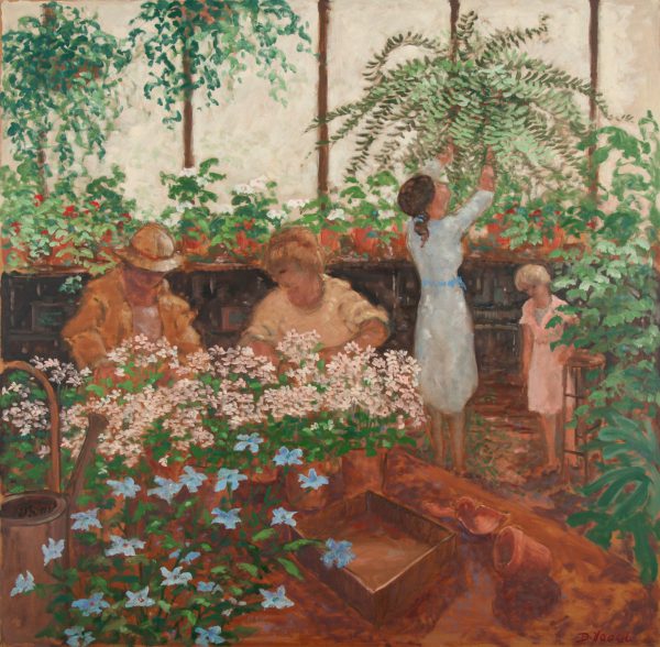
In about 1976, Donald started to explore a subject that was not unique, but one under-utilized by other artists, and as it turned out, perfectly suited his temperament. As a young boy, he worked on an estate outside of Cary, Illinois that had a greenhouse on it. Remembering this unusual light filled space, he executed an imaginary painting of the interior of a greenhouse. He thought it such an interesting subject that he immediately painted several more. This subject provided him with an endless opportunity to investigate the lighting effects the interior of a greenhouse affords. He could explore not only the color and shapes of the blooming plants, but also the light filtering through the whitewashed windows and the visual weight of the moist air proliferating through the space. He could contrast the interior cool light he created with the warm light seen through an open door or window revealing the atmospheric juncture between two worlds. It also afforded compositional opportunities with the architectural structures he imagined that made up the enclosures. The greenhouse became a theme to which he would often return.
One is Not Enough
Donald’s painting career spanned well over 60 years. He was incredibly lucky as a painter because he worked in a style and direction totally of his own choosing and did not have to divert from this path to be successful. The greatest compliment to his legacy is how much his collectors enjoyed living with one of his paintings, often enough to have acquired a second.
If asked by another artist how he handled creating what he considered an unsuccessful painting, he would say, “Never be afraid to paint a bad painting, you learn as much from a bad painting as one that was successful.” He would then say that if he considered a work unsuccessful, it would never leave his studio.
Technical Notes:
Preparing a Support
Until 1945, most of Donald’s early work was painted on canvas. Between 1945 and 1975, he slowly shifted from using canvas as a support to painting on Masonite panels. From then on, most of his paintings from the 48 x 60-inch size size and smaller were painted on panel. With only a few exceptions, larger works were painted on canvas for practical reasons.
He liked working on Masonite because it was a hard surface to work against and it was easy to handle, store and was puncture resistant. Since Masonite is dark in color, he liked the idea of working from dark to light rather than light to dark as is often done when painting on a primed canvas. He even incorporated the dark of the Masonite into his paintings on occasion.
After cutting a Standard Masonite panel to size, he would sand the smooth side of the panel with #80 grit sandpaper in a vertical, and then horizontal direction cutting into its surface to give it a tooth that would hold the paint. (He would never use Tempered Masonite because it was soaked in oil as part of the tempering process, and from experience he had discovered that oil paint would not adhere as well.) He would then seal the panel with Orange Shellac thinned with Methanol by approximately 50-60%. This would keep the oil in the paint from absorbing into the panel and turning the pigment matte. The Shellac would dry quickly, and the panel was ready to go in an hour. (I would personally also recommend shellacking the back side of the panel. This would slow down the panel’s absorption of humidity that could make it sensitive to warping.)
Standardized sizes
Masonite comes in 4 x 8 sheets and Donald would cut the sheets into the optimum number of sizes to maximize using an entire sheet. To this end, the sizes he chose to use were standardized into 8 x 10, 10 x 12, 16 x 20, 20 x 24, on up to 48 x 60 inches. By using a size standard that suited his work, he was able to reuse frames whenever he wanted.
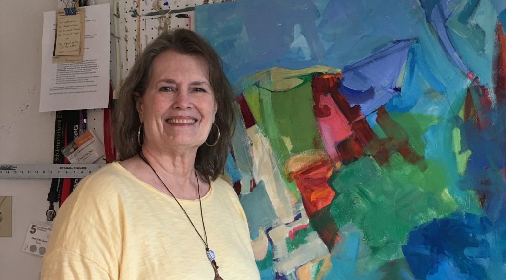
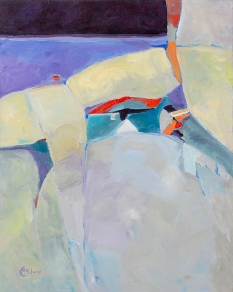
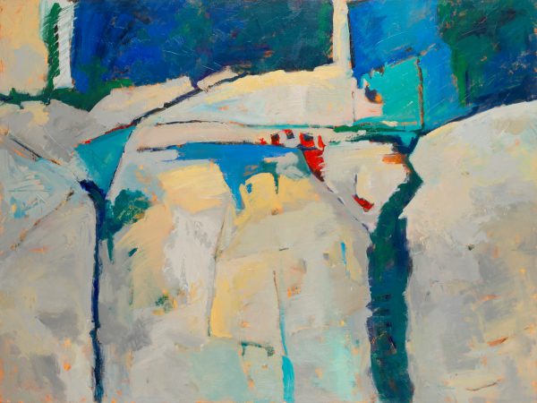
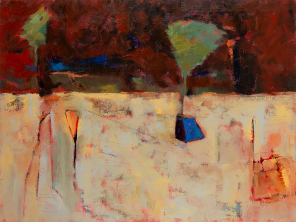
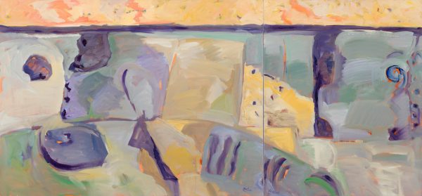
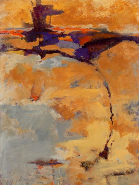
Cheryl McClure has always enjoyed the advantages abstract painting allows. Instead of being bound by the confines plein air landscape painting imposes, she is much happier letting the memory and feel of a place inform the direction her abstract paintings ultimately take. She is interested in the formal elements of surface, color relationships, and the design aspects of a painted surface rather than just rendering her version of reality. By following this path, Cheryl has truly found freedom through abstraction.
Beginnings:
In 1945, Cheryl D. McClure was born in the small town of Hugo, Oklahoma, located just across the Red River from Paris, Texas. As opposed to many children who become artists, she did not spend all her spare time drawing or even showing much interest in art as a young child. However, when art did start to interest her, she remembered that from a very early age, she was oddly more interested in the shapes and colors that formed the subject of an artwork, than the actual subject itself.
At the age of 8, she decided that she would like to try her hand at painting, so her father signed her up for the only art class in town. He bought her the required artist materials, and she joined the class. To her utter disappointment, she discovered that the only painting taught in this class was how to paint my number.
Finding One’s Passion:
In her early 20’s she moved to Longview, Texas and started to involve herself as a volunteer at the Longview Museum of Fine Arts. She also started attending lectures and demonstrations sponsored by the East Texas Fine Arts Association. Cheryl said of this period that she learned a great deal about art and artists, and this interaction inspired her to attend a watercolor class associated with ETFAA. She found watercolor tedious because to do it well required a lot of compositional preplanning, but it also showed her the importance of negative space.
Developing a Studio Practice:
On her own, she explored working in other mediums like charcoal and pastel. The medium she ultimately gravitated to was acrylic. This medium allowed her to quickly layer and texture the paint on a support without having to wait the long periods between applications, that oil paint would often require. This allowed her to be more gestural and spontaneous with her paint application, an approach better suited to her preferred studio practice.
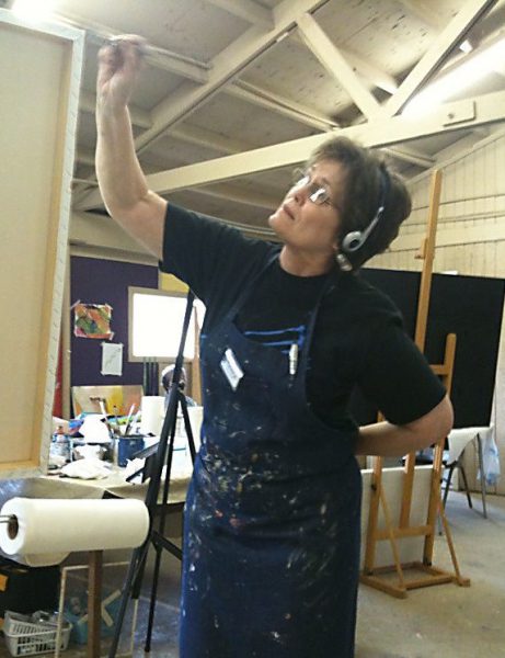
When Cheryl paints with acrylic on canvas, she does so quickly, allowing her feelings to be expressed with determined gestural strokes. After reaching a point of indecision, she will stop and spend time studying where the painting stands and determining what is needed next to advance it towards completion. She then repeats this process until the elements of color, texture, and their relationships harmonize.
Discovering Encaustic:
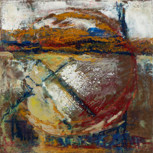
In 2005, she discovered Encaustic. Cheryl was excited by how quickly a layer of wax would cool and harden, allowing her to quickly apply another translucent wax layer of color and add texture. Although it was not as freeing as using acrylic pigments, it provided another medium that was sympathetic to her preferred working method. This became another compatible medium for her to use in her quest to find freedom through abstraction.
She became well known as an artist and arts patron in Longview, ultimately living there for 41 years. As her reputation grew, she developed long-term relationships with 5 galleries around the country. In addition to an extensive exhibition history, she is asked to teach painting workshops and her work is often used to illustrate books.
Accomplishments:
I asked Cheryl what things she was most proud of in her artistic career to date. She quickly listed three things:
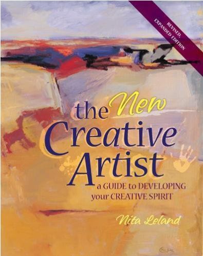
One of the books that was most influential on her as an artist was, A Fine Artist’s guide to Expanding Your Creativity. She was thrilled when one of her paintings was chosen to be on the cover of its updated edition titled, The New Creative Artist, Revised, Expanded Edition, a Guide to Developing your Creative Spirit.
The Poet Theodore Worozbyt asked Cheryl to collaborate on a book of his poetry titled Smaller Than Death, published by Knut House Press in 2015. In addition to the book’s cover, 15 of her graphic wax resin paintings were illustrated in color. They were from a series of paintings she did titled Johnson Creek Field Notes, inspired by walking along a creek that runs through her property.
In 2011, she was a finalist for the Hunting Art Prize, an annual event to award $50,000 to a Texas artist for excellence in drawing and painting.
For the past 12 years, she has lived on a farm located just outside New London, a little town Southeast of Tyler, Texas. Her three room second floor studio has a room set up for painting and a dedicated well-ventilated room set up for her to work in Encaustic when she wants a change. She works most every day either producing or thinking about producing her next adventure into her world of abstraction.
The FAE Collector Blog provides easy access to more in-depth information about the Collections and Artists that appear on the FAE Website. The FAE Collector Blog Table of Contents consists of:
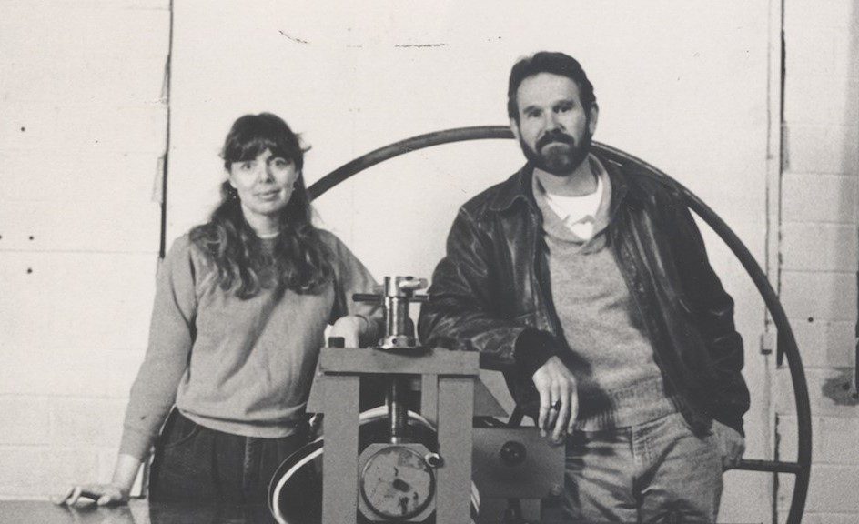
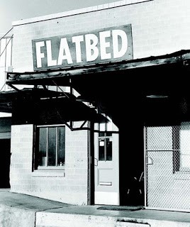
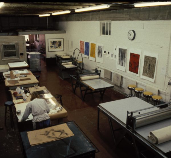
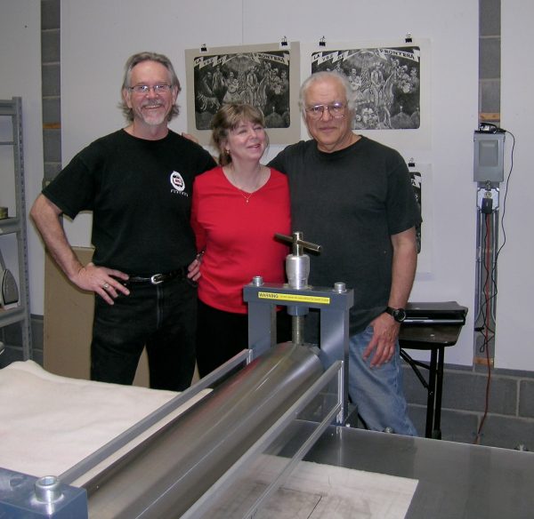
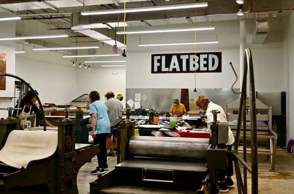
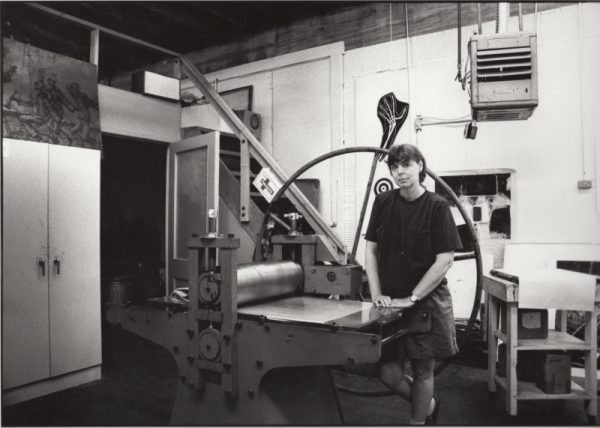
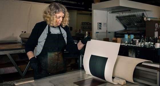
It would be accurate to say that Austin-based Flatbed Center for Contemporary Printmaking is one of Texas’ most respected Fine Art Institutions. Its antecedent, Flatbed Press was founded in 1989 when artist/educators Katherine Brimberry and Mark Lesly Smith partnered to open a Fine Art Press in a small warehouse on West 3rd Street, just west of downtown. Following the model of the famed Dallas-based Peregrine Press, their dream was to make the printmaking arts available to emerging artists, especially those who lived/worked in Texas.
Katherine and Mark equipped their space with everything they needed to produce prints in the traditional relief, planographic, and intaglio techniques and provided a gallery space for exhibitions of prints. Since both had full-time teaching positions, they spent most of their spare time teaching interested artists the art of printmaking, and then editioned the works they produced. They also pursued publishing projects, did contract printing for those artists who were experienced, and allowed artists to rent the presses when available. They quickly became known for their collaborative skills and were sought out by those artists who seriously wanted to see how their vision would translate into the medium.
We need More Space: First Move
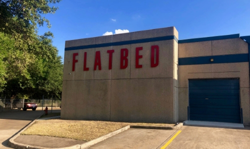
They realized that their West 3rd Street space did not allow for growth, so in 1999, they moved their operation to an 18,000+ square foot warehouse in East Austin on Martin Luther King Blvd. To commit fully to the project, both Katherine and Mark gave up their teaching positions to run Flatbed full time. They wanted to make their new home more than a press and gallery, so they subleased the space they did not need to artists and other creatives.
In the years that followed, Flatbed became the most highly respected press in Texas. A partial list of the Texas artist luminaries the press has either published or printed for includes: Terry Allen, Luis Jiménez, Mary McCleary, Melissa Miller, Andrea Rosenberg, John Alexander, Keith Carter, Trenton Doyle Hancock, Billy Hassell, Sharon Kopriva, Bert Long, Linda Ridgeway, Julie Speed, David Everett, and James Surls. In addition to their standing as a fine art press, their building became the epicenter of the burgeoning East Austin arts scene.
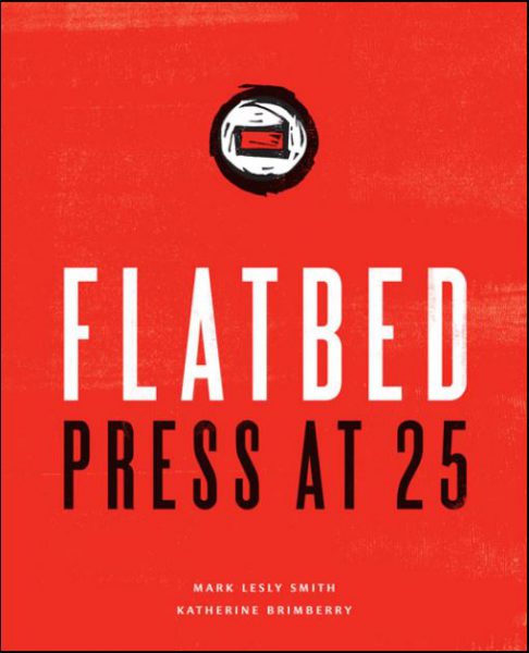
Co-founder Mark Smith left the business in 2012 to pursue his own art. However, because of his ongoing friendship with Katherine, Mark collaborated with her on an anniversary book about the press titled Flatbed Press at 25, published by the University of Texas Press in 2016.
Losing their lease: Second Move
As often happens when artists move into an area, it becomes gentrified, rents soar, and either the artist is hit with lease renewals they cannot afford or the landlord decides to not renew at all so they can repurpose their buildings. In this case, in 2019, Flatbed fell victim to the latter scenario.
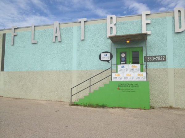
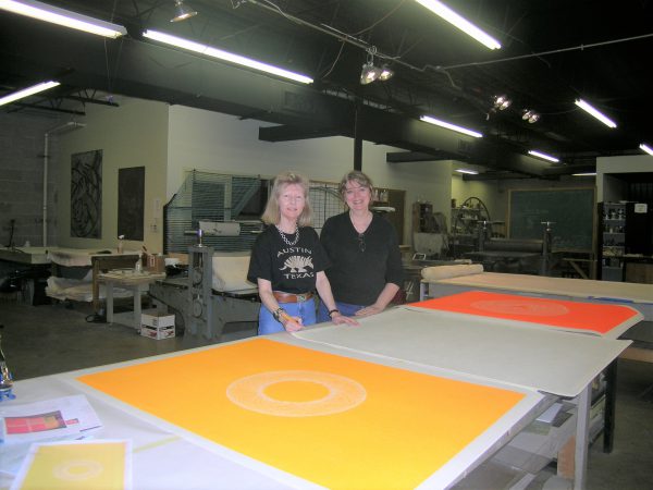
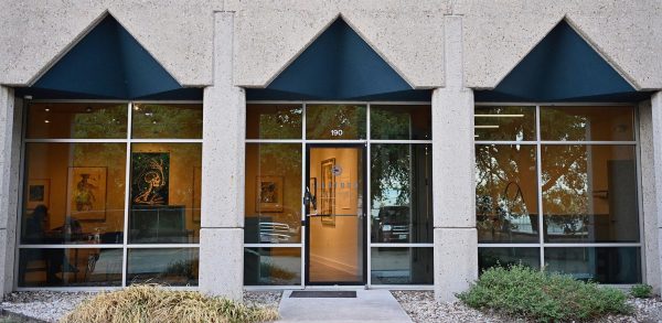
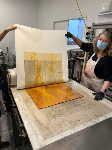
At this point, most people who had reached a normal retirement age and were faced with losing their lease would have closed their business. But instead, Katherine decided that what she had built was more important and needed to continue. She moved the Press to a new 6,000 square foot space, renamed it Flatbed Center for Contemporary Printmaking.
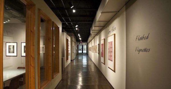
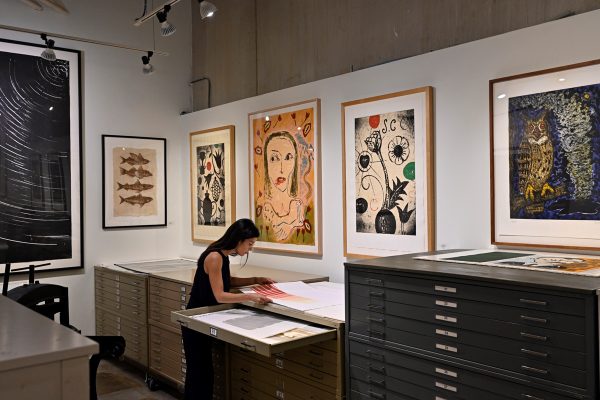
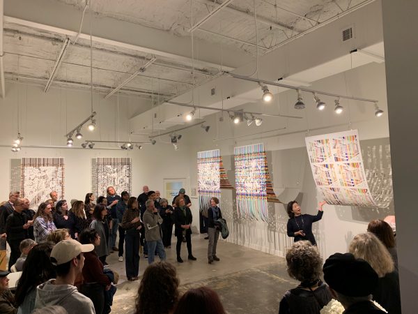
In addition to what they have always been doing, Katherine made the business more community oriented with print making classes and 24-hour membership access. She also designed a new gallery into the space, so Flatbed is able to host both traditional and experimental print-based exhibitions.
Katherine the Great:
What has made Flatbed such a successful institution are the people who have managed it. In Katherine’s case, because of her teaching background, calm demeanor, and depth of knowledge, she excels at collaborating with artists. After working together on a project, artist Betty Ward called her an extreme facilitator, then added, Working with Kathy was almost like, working with yourself.
Regarding her role, Katherine says, The main objective of a publishing press is to help artists who may not be familiar with printmaking. Our role is to help them create work in the fine art print medium by being technical collaborators. All the mark-making and decision-making is their own, with our technical assistance. There is a long tradition of this type of collaboration in the printmaking world. If the artist approves and the type of technique allows it, we are able to create small editions of hand-printed multiples.
The prints she helps publish vary in style, technique, subject, and size, but are all the unique creations of the artists by their own hands. Some of the techniques derive from the 17th century, and some involve the latest digital resources. The artist’s experience in the shop is often an experimental blend of old and new printmaking processes. Each project is artist-driven; the shop’s motto is- What would happen if . . .?
FAE is pleased to be collaborating with Flatbed and now has prints available from the Flatbed Press collection. Check back regularly to see what new works have been posed by this Texas fine art institution.
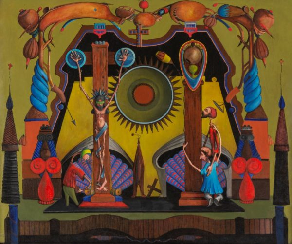
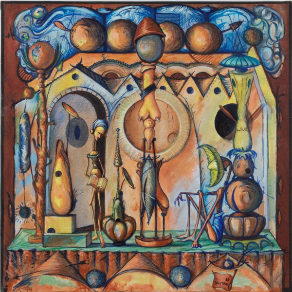
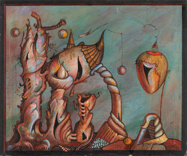
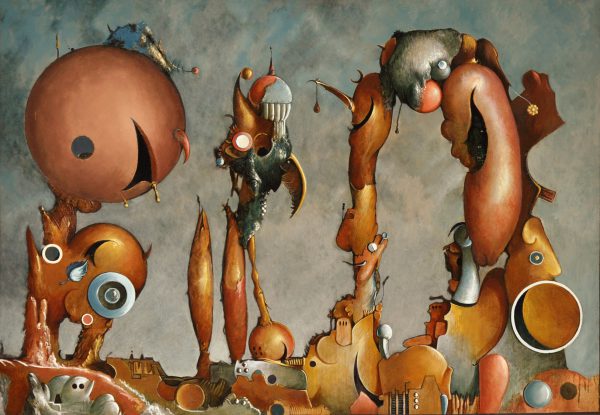
In 1969, at the age of 25, the exceptionally talented Visionary painter Valton Ray Tyler painted these three extraordinary and extremely rare to market oil paintings that are now available on FAE. At the time, although his living conditions had stabilized, he was suffering radical mood swings caused by his life-long fight with Manic Depression, or what is now known as Bipolar Disorder. All three are different in temperament and foreshadow the direction his work would take over the next 48 years.
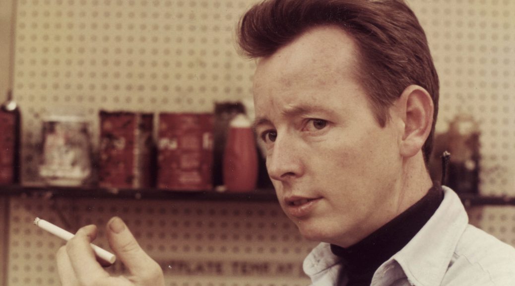
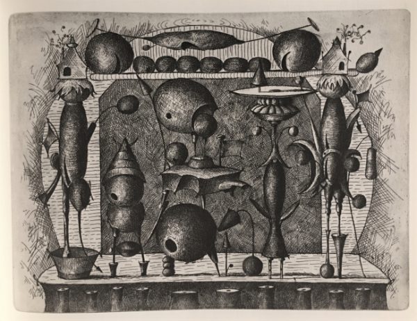
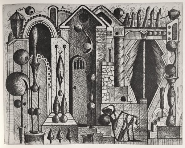
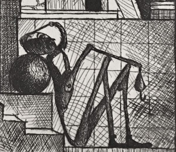
In the beginning of 1970, Valton’s life would take a radical swing towards the Manic. His brother was desperate to try to help Valton find his way and to determine if he really had talent, or if his artwork was just self-devised therapy. He brought Valton and a portfolio of his drawings to Dallas art dealer, Donald Vogel. Vogel was impressed enough with Valton’s talent and creativity that he arranged for Valton to use the printmaking department at Southern Methodist University under the watchful eye of Larry Schoelder, who ran the department. To help keep Valton supplied, Vogel agreed to purchase all of Valton’s plates and paper as long as he wanted to produce prints. Valton became sort of an artist in residence without portfolio at SMU and worked when classes were not in session, often well into the night. During this intense period of productivity, by October of 1971, Valton had started editions on over 50 different intaglio prints.
Valton used themes and working methods in these three earlier paintings that he modified to use in making his black and white intaglio prints. He used a similar cross hatching technique to give the forms he created volume and, when a figure appeared in his prints, he often elongated their limbs in a sort of hyper-Mannerist style.
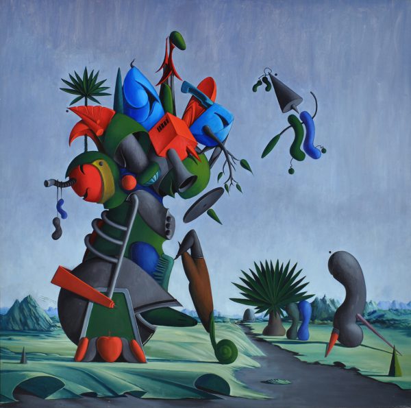
After Valton’s intensely focused period of printmaking, he started working in oil on stretched canvas. With these works, unlike his earlier paintings and prints where three-dimensional form was derived from crosshatched strokes,
Valton started to render form by carefully blended smooth shading. With practice, Valton was able to subtly render a graduated background shade that would work its way across large canvases. He also started to place his quasi-plant and machine-like organic forms into landscape settings.
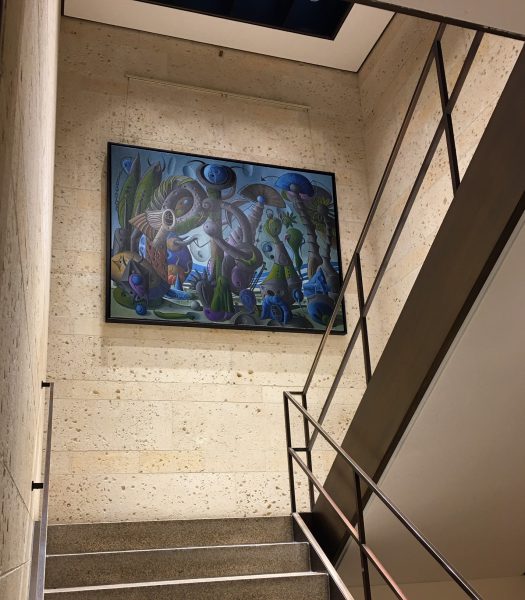
Before Valton passed away, he was honored with a one-person show of his prints and paintings at the Amon Carter Museum of American Art in Fort Worth, Texas. Below is the last large painting Valton painted before his death. It was donated to the Amon Carter by one of his family members and is currently hanging in a transitional stairwell.